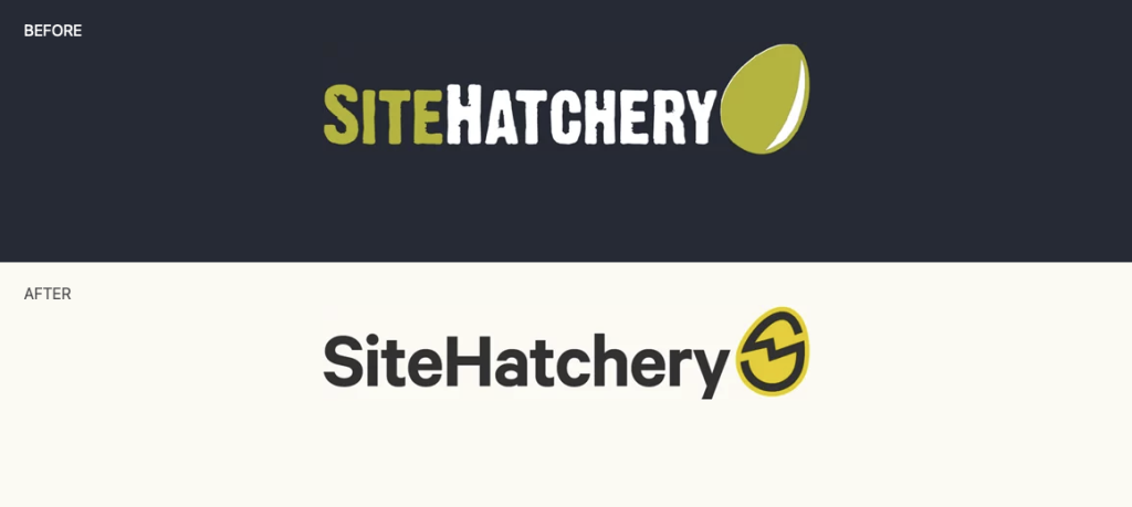
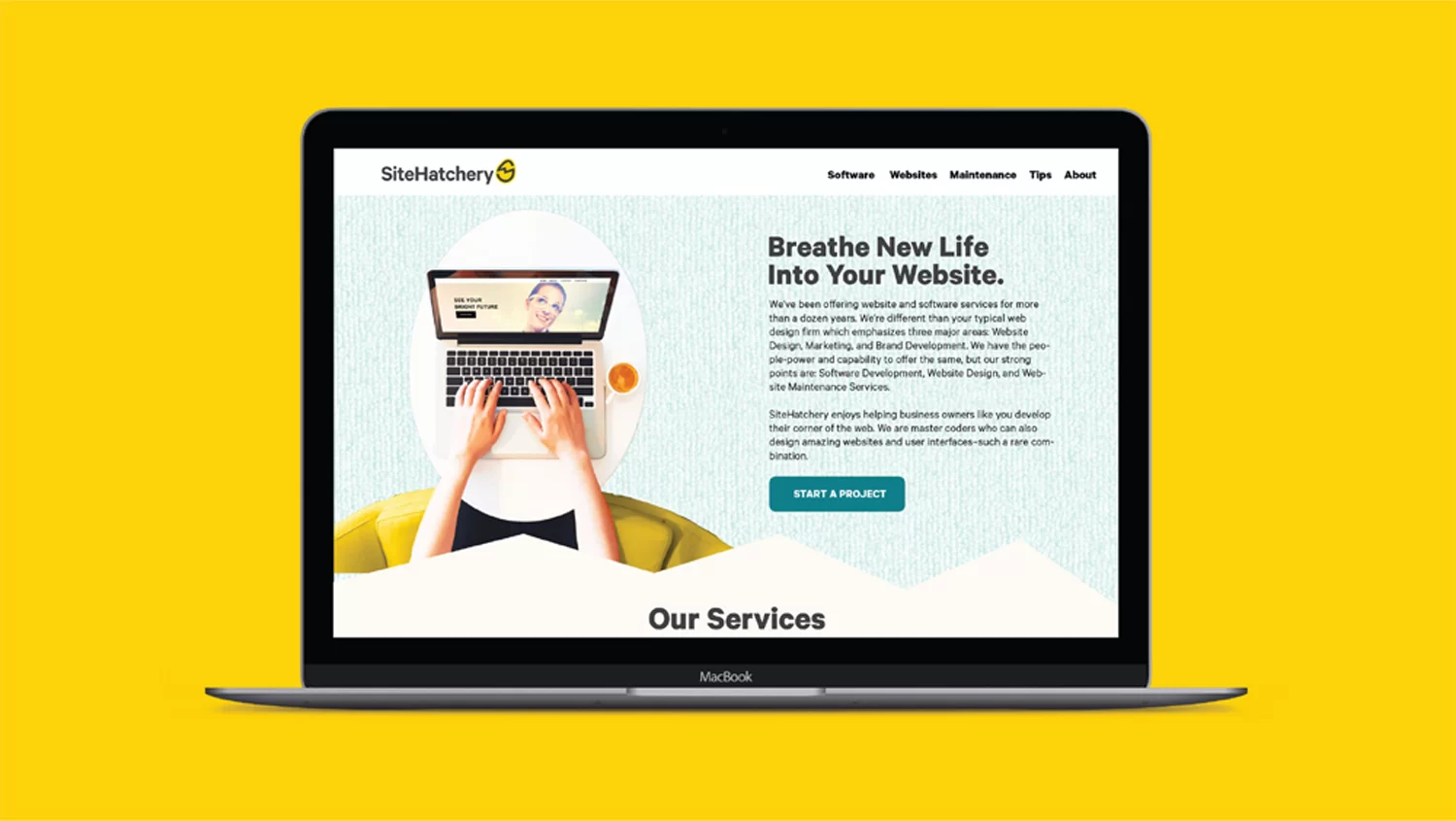
Our primary objective in this project is to empower Site Hatchery’s transition from custom software to the realm of exquisitely designed and developed websites. A paramount focus lies in crafting a visual identity that exudes modernity, instills trust, and embodies distinction.
As an agency, the work we produce for our clients becomes an extension of our brand identity. Our creations serve as the “sentence,” while the logo acts as the definitive “period,” punctuating and reinforcing our message.
The revitalized Site Hatchery logo aims to:
Engage business owners across a diverse range of industries, resonating with a broad spectrum of enterprises.
Effectively rival the allure of “do-it-yourself” alternatives, catering to business owners seeking professional expertise.
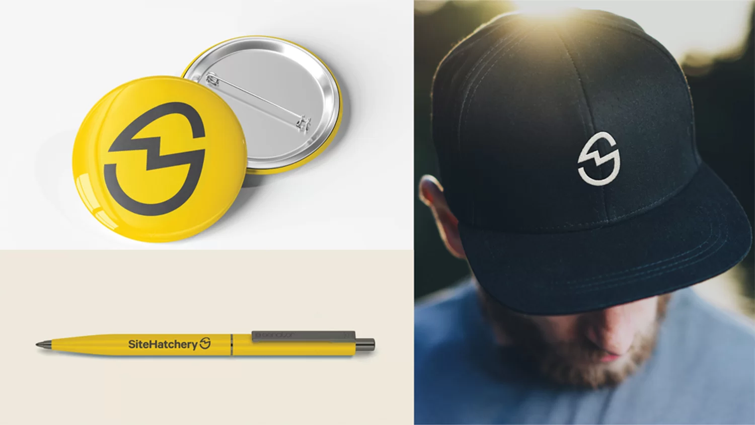
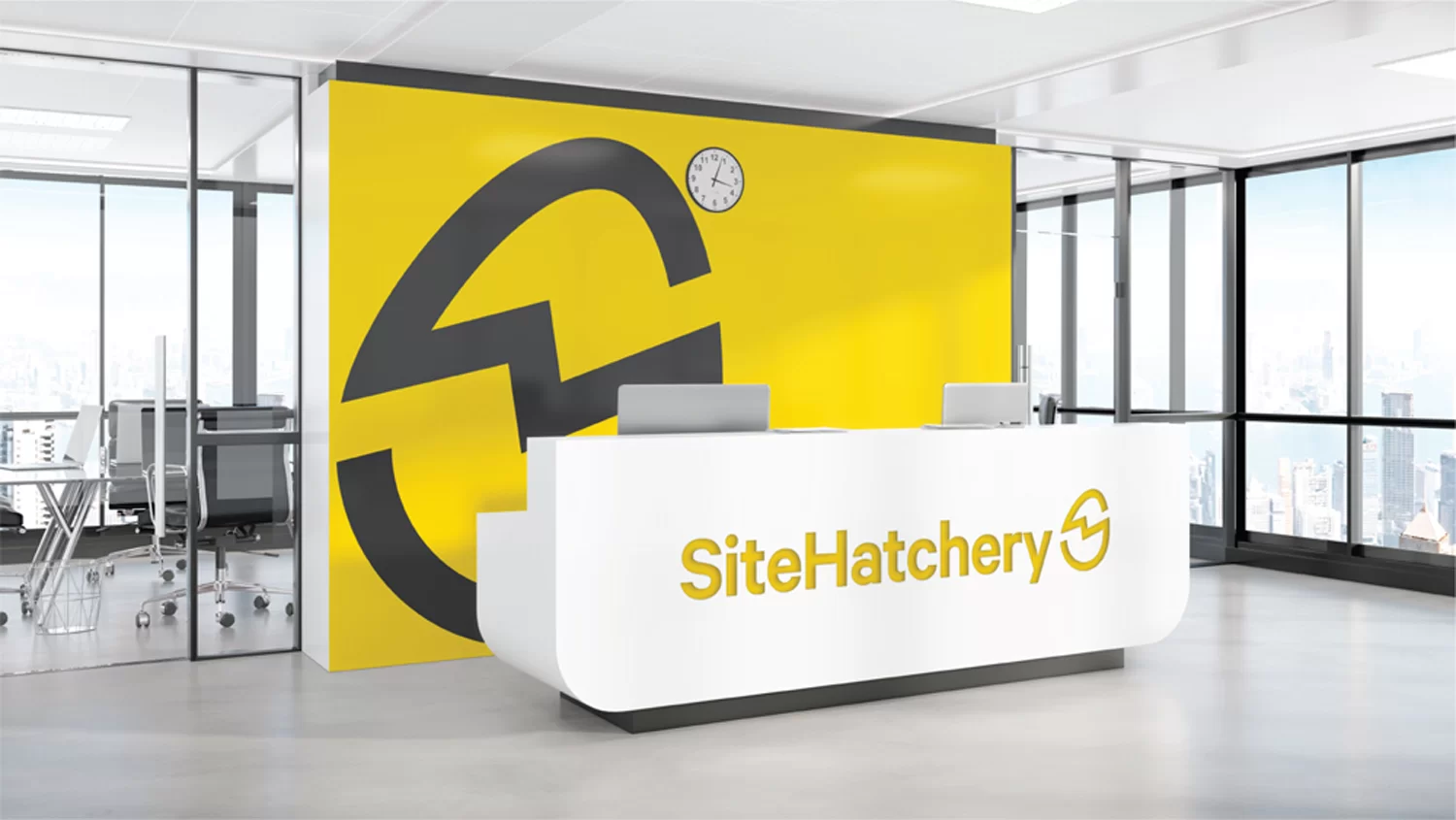
Seamlessly adapt to various contexts and applications, extending beyond the confines of a website’s top-left corner.
Amplify distinctiveness, crafting a mark that becomes unequivocally associated with the unique essence of Site Hatchery.
Choosing a Direction
Charting our course towards logo enhancement necessitates a comprehensive assessment of its strengths and weaknesses. The egg, as a central element, holds tremendous value, aligning conceptually and warranting its preservation.
Outlined below are the pivotal concerns that demand resolution from both a formal design and strategic standpoint. Through strategic refinement and deliberate design decisions, we will chart a path towards an elevated logo experience.
Text appears dirty, disorganized, and unprofessional. The texture limits the logo from scaling well.
The logo has an organic feel, which is more appropriate for an actual hatchery than a tech firm.
The form of the symbol and the style of the typography clashes, leaving both elements feeling out of place.
The combination of shape and color makes it difficult to read “egg”, and could be confused for an avocado.
The Egg is so large, it creates a very large negative space gap at the top.
There are many inconsistent uses of the egg which dilute it’s effectiveness.
The Egg’s most distinctive feature (rotation) is less effective on applications that don’t have an orientation.
The logo is not available in vector format, which causes the logo to lose quality when it is scaled up.
The Egg Shape
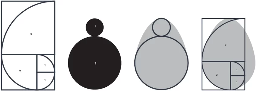
The egg symbolizes the essence of new beginnings, representing freshness and vitality. Visually, we can refine its proportions to enhance its aesthetic appeal and visual impact.
While the golden ratio and Fibonacci Sequence aren’t inherently magical, their application brings forth a sense of harmony and equilibrium. Interestingly, a natural egg inherently follows this pattern, further reinforcing its organic beauty and timeless allure. By embracing these principles, we can achieve visual coherence and evoke a sense of natural balance within the logo.
The Egg Redefined
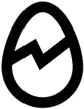
While the foundational shape of the egg has been established, it is crucial to enhance its recognizability and uniqueness. Merely relying on rotation alone is insufficient, necessitating a strategic approach to emphasize its silhouette.
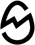
To address this, I propose a solution that outlines the contours of the egg, incorporates a subtle crack symbolizing hatching, and strategically integrates abstract cuts to form the letter “S,” representing Site Hatchery. This fusion of elements not only adds depth and intrigue to the logo but also reinforces the brand’s identity in a visually engaging manner.
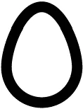
The basic egg shape. Optimized to be seen as an egg and not any other object.
Using an outline is the first step to making the egg have a more distinct silhouette.
A simple but effective line implying the hatching. Using a lighting bolt shape for the hatch line implies speed and electricity
Withcutouts above and below the hatch line, an abstract letter “S” is created. Th is is a key feature that makes the logo ownable.
Typography
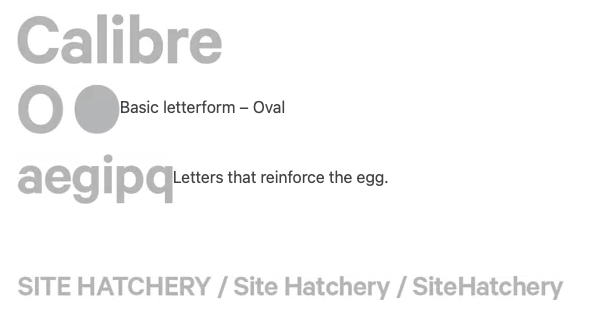
With the egg taking center stage in the logo, the next step is to find the perfect pairing for the accompanying name. The objective is to discover a font that strikes a harmonious balance with the egg while ensuring optimal legibility.
To establish a sense of coherence and visual continuity, an oval-shaped font is the ideal choice. After careful consideration, I have selected Calibre by Klim Type Foundry as the perfect match.
Calibre boasts exceptional legibility while infusing a subtle touch of quirkiness, maintaining a professional and trustworthy aesthetic. Its oval structure echoes the curves of the egg, creating a cohesive and visually pleasing union between the icon and the font.
I have made the deliberate decision to set the name in mixed case, eliminating spaces between the two distinct words. By utilizing lowercase letters, I enhance the inherent charm and “eggy” quality of the ovular typeface, allowing it to truly shine. This approach reinforces the cohesive and visually pleasing connection between the name and the logo, while adding a touch of playfulness to the overall design.
Lockup
FIG 01. The font is weighted heavier than the egg, so the egg is not confused as a letter.
FIG 01. The font is weighted heavier than the egg, so the egg is not confused as a letter.
FIG 03. The egg is positioned at the end of the name, similar to the original.
FIG 04. The egg is rotated on the same axis of the diagonal of the “y”, enhancing harmony.
Alternate Lockup
Now that the egg’s uniqueness no longer solely relies on its position, we have the freedom to explore various configurations of the logo. When faced with applications that demand a more vertical aspect ratio, we can confidently position the egg at the top of the wordmark, resulting in a visually pleasing and balanced composition. This flexibility allows the logo to adapt seamlessly to different layouts and environments, ensuring its effectiveness across a range of mediums and platforms.
Old Colors
The color palette currently in use is functional, but there is an opportunity for evolution and enhancement. The existing shade of the egg, with its strong green hue, can unintentionally evoke negative associations such as resemblances to avocados or the phrase “Green eggs and ham,” which may be perceived as repulsive.
To address this, I propose a shift towards a more vibrant and authentic yellow as the primary brand color. This choice not only aligns closely with the natural color of eggs but also evokes the imagery of hatching chicks, symbolizing new beginnings and fresh opportunities.
New Colors
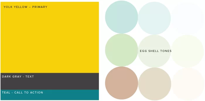
I have curated a color palette that I highly recommend for SiteHatchery. The selection consists of carefully chosen colors that effectively convey the desired brand identity.
The vibrant yellow chosen for the primary color is not only visually striking but also offers excellent contrast when paired with both black and white. This ensures legibility and visual impact across various applications.
To complement the yellow, I have included a beautiful shade of teal. This secondary color serves as a compelling call-to-action hue, inviting engagement and capturing attention.
In order to represent the diverse range of clients that SiteHatchery serves, I propose incorporating different eggshell colors. These variations help to soften the visual impact of a black and yellow palette, creating a more harmonious and inclusive aesthetic.
Graphic Language
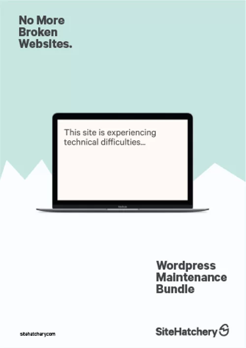
The expanded elements within the logo offer a wealth of opportunities to develop a comprehensive graphic language that extends beyond the logo itself. These additional elements can be extracted and utilized to enhance various aspects of the brand identity.
For instance, the distinctive “hatch lines” found within the logo can be employed as creative dividers, effectively separating content and adding visual interest to different sections. This graphic element adds a dynamic touch, reinforcing the concept of growth and new beginnings.
Furthermore, the iconic egg shape can be utilized as a versatile container, allowing for creative compositions and the possibility of elements breaking out of it. This approach not only adds a sense of depth and dimension but also reinforces the brand’s core concept of “hatching” new ideas and possibilities.
To showcase the potential of these new elements, I have created a captivating mock series of posters. These posters serve as a visual representation of how these innovative design elements can be effectively applied across various communication materials, offering a glimpse into the exciting possibilities they bring to the brand’s visual identity.
At Chico Web Design, a California-based design studio, we specialize in creating enduring logos that bring long-term success to businesses. Contact us today via email or phone to discuss your logo design needs.
20% Discount
Through May 31, we are offering a 20% discount on all new web design contacts! The discount will be displayed on the agreement.