Enhanced Flexibility: A refreshed logo ensures it can adapt to various formats and constraints effortlessly.
Cohesive Representation: While retaining the main elements of the current icon, we’ll rework them into a balanced and cohesive design.
Establish Trust and Credibility: Through the logo refresh, we aim to communicate a credible and trustworthy tone.
Goals for NCTTC:
Create a versatile logo that seamlessly fits different applications.
Transform the existing elements into a balanced and unified representation.
Convey a sense of credibility and trustworthiness.
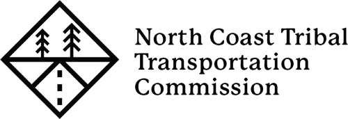
Build the Icon
1. Start with the diamond shape inspired from street signs and the central focus of Native American patterns.
2. Rather than having the triangular shape pattern on the outside of the diamond, place it on the inside.
3. Tweak the center triangle of the pattern to create a perspective road.
4. Stylize the redwood trees using the same angles and similar visual weight as the rest of the line work.
Typography
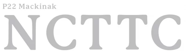
As we finalize the icon, the next consideration is choosing the perfect typography to accompany it. Given the sleek and sharp nature of the icon, I suggest opting for a softer serif font to create a compelling contrast.
Enter P22 Mackinak, a typeface that shares structural similarities with the original logo, preserving its established equity. This font strikes an ideal balance between professionalism and approachability, enabling a polished image when engaging with governmental entities, while maintaining a friendly appeal to the individuals they advocate for.
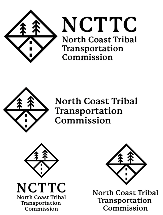
Logo Configurations
The original logo strategically employs enlarged capital letters at the beginning of each word, effectively drawing attention to the “NCTTC” initials.
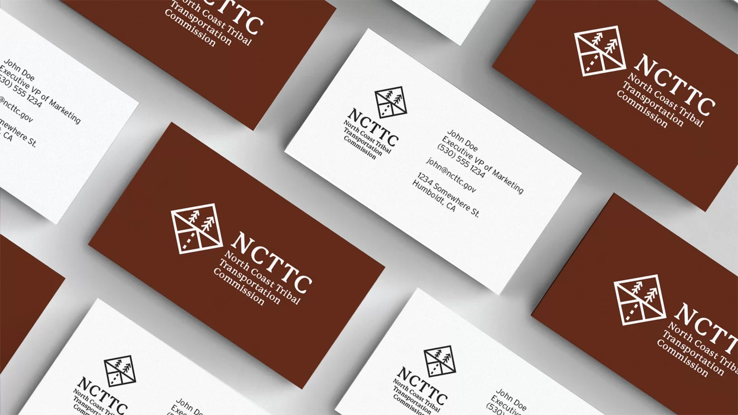
When integrating the icon with the text, my primary recommendation would be to utilize a combination of the initials and the full name. This approach allows for swift comprehension while ensuring all essential information is preserved.
To achieve a streamlined and refined appearance, the first line of text is aligned with the edge of the initials, creating a clean and cohesive transition from the tapering rag of the full name.
North Coast Tribal Transportation Committee with Initials: When arranging the logo in a stacked configuration, it is advisable to employ centered text justification for optimal balance and visual harmony.
North Coast Tribal Transportation Committee without initials: This rendition omits the initials and focuses solely on the name. While it requires a slightly broader space than the previous version, it maintains visual interest. Notably, “North Coast Tribal” is positioned on the top half of the icon, featuring trees, while “Transportation Committee” resides on the lower half, alongside the road.
Logo with Initials - Horizontal
Typography is the art and technique of arranging type to make written language legible, readable, and appealing when displayed.
Logo with Initials - Stacked
It involves selecting typefaces, point sizes, line lengths, line-spacing, and letter-spacing, among other things, to create a balanced and visually appealing composition of printed or displayed text.
No Initials - Horizontal
Typography plays a crucial role in design, branding, and communication, as it can evoke specific emotions, convey meaning, and enhance the overall message being communicated.
No Initials - Stacked
It’s not only about selecting the right fonts, but also about using hierarchy, spacing, and formatting to guide the reader’s eye, create visual harmony, and enhance the overall user experience.
At Chico Web Design, a California-based design studio, we specialize in creating enduring logos that bring long-term success to businesses. Contact us today via email or phone to discuss your logo design needs.
20% Discount
Through May 31, we are offering a 20% discount on all new web design contacts! The discount will be displayed on the agreement.