The need for a website that seamlessly adapts to varying screen sizes has become paramount. Welcome to the world of mobile phone responsive web design—a game-changer in the realm of user experience and SEO optimization.
Want to update your website with a responsive design? We can help! Get a Qute Here.
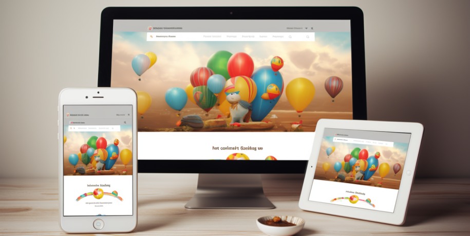
Website Designs for Desktop, Tablet & Smartphones
Responsive web design ensures that your website layout adjusts dynamically to suit the screen it’s viewed.

This flexibility translates to an enhanced user experience, and here’s why it matters:
1. Mobile-Friendly Magic
In a mobile-centric age, where over half of all internet traffic comes from mobile devices, having a mobile-friendly website is no longer a choice but a necessity. Responsive design ensures that your site looks and functions seamlessly on smartphones, keeping your audience engaged regardless of the device they use.
2. Enhanced User Experience (UX)
A responsive website means more than just fitting into different screens—it means providing an optimal viewing experience. Elements like easy navigation, readable text, and well-placed images contribute to an enhanced UX. Visitors are more likely to stay and explore when your site caters to their device, fostering a positive interaction.
In an era marked by the constant influx of information and rapid technological advancements, user attention spans have become increasingly fleeting. The ubiquity of mobile devices has empowered users to access information at their fingertips, but it has also intensified the demand for seamless and efficient experiences.
A website that isn’t optimized for mobile devices risks losing user engagement due to the frustration caused by navigation challenges and slow loading times. The immediacy of information consumption today demands websites to be not only informative but also easily accessible across various devices.
Ensuring a smooth and responsive user experience, particularly on mobile, has become imperative for capturing and retaining the fleeting attention of today’s users.
Get a free instant quote HERE.

3. SEO Boost: Google’s Favorite
Google, the search engine behemoth, favors responsive websites. The search giant emphasizes user experience in its ranking algorithms, and a mobile-friendly site is a significant factor. Responsive design, by offering a consistent user experience across devices, gives your website an SEO boost, potentially elevating it in search engine rankings.
Also using the right keywords is imperative. For example, we would include words such as Responsive Web Design, Mobile-friendly, User Experience, SEO optimization, Website Adaptability, Cost-effective Web Design, Google Ranking Factors & Future-proof Web Design throughout this blog page to improve SEO.
4. Cost-Effective Adaptability
Creating separate websites for different devices is not only impractical but also costly to maintain. Responsive design streamlines this by offering a single site that adapts universally. It’s a cost-effective solution that ensures your website remains adaptable to the evolving landscape of digital devices.
We love to build websites using WordPress and Elementor to accomplish this goal. Need Help? Contact Us Here.
5. Future-Proof Your Presence
The digital landscape is ever-evolving, with new devices and screen sizes continually emerging. Responsive design is a future-proof strategy, providing a foundation that can adapt to the devices of tomorrow without the need for a complete overhaul.
It’s About the Experience
Embarking on a user experience journey through a responsive website is akin to a seamless adventure, where accessibility and engagement intertwine. As users navigate the site on diverse devices, the responsive design ensures a consistent and optimized experience, maintaining functionality and aesthetics across the spectrum. The journey unfolds effortlessly, with each interaction tailored to the specific nuances of the user’s device—whether it’s a desktop, tablet, or mobile phone.

The visual appeal remains intact, and the intuitive navigation adapts, creating a harmonious and enjoyable experience. This responsive design approach not only caters to the diversity of devices but also resonates with the evolving expectations of users in an increasingly mobile-centric world. It’s a journey that not only enhances user satisfaction but also underscores the pivotal role of responsive design in shaping the future of online interactions.
In a Nutshell: Your Responsive Journey Begins
Responsive web design is not just a trend; it’s a necessity. From improved user experience to favorable treatment by search engines, the advantages are clear. If your website isn’t responsive yet, you’re not just missing out on potential leads—you might be losing your current audience’s interest.
Embark on the journey of responsive design, and let your website shine across all devices. The future of user experience and SEO optimization is responsive—make sure your website doesn’t get left behind!
Ready to Update Your Website?
If you’re ready to set up a responsive website, reach out to us. Our team is here to guide you through the process and ensure that your website becomes the best it can be.
Contact Us. View our Portfolio here.