Firm Family Church Logo
Firm Family Church Logo
The Goal:
Our goal for the new logo of Firm Family Church is to establish a strong presence in the community as a dynamic and friendly organization appealing to younger families. We aim to create a distinct and original mark, avoiding common design tropes associated with churches, while ensuring simplicity and flexibility for digital and physical platforms. By meeting these criteria, the logo will effectively represent the church’s unique identity and resonate with its target audience.
Key Concept
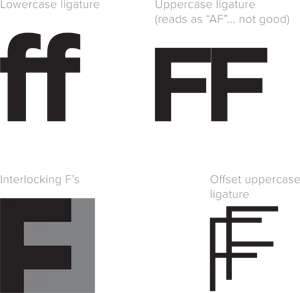
To create a logo that resonates without giving overly church-y vibes, a sleek and simple letter mark is the ideal approach. Firm Family Church embodies the concept of connection and emphasizes the idea of being a family, whether through blood or not. This opens up a myriad of visual possibilities to convey our unique approach. Additionally, the alliteration between the main initials of the church’s name and “FF” adds a playful and memorable touch to the logo design.
Building the Icon
During the exploration phase, an intriguing discovery was made—a captivating design featuring two interlocking F’s within a single letterform. This custom mark offers a compact and distinctive visual representation. Its conceptual significance lies in conveying a sense of connection while minimizing potential negative connotations. To enhance the overall aesthetics and infuse a friendly vibe, the angularity of the standalone F was balanced by enclosing it within a circular container. This not only adds a touch of warmth but also ensures seamless adaptability across various layouts, eliminating any concerns about awkward negative space. Additionally, the logo’s scalability remains effortless, allowing for easy implementation across different platforms.

Typography
With the icon firmly in place, the focus now shifts to the typography of the logo. Given the icon’s sharp and clean design, it is recommended to use a softer font to create a striking contrast.
One suitable typeface for this purpose is Brandon Grotesque. Its geometric structure, complemented by subtly rounded corners, strikes a perfect balance between modern aesthetics and a friendly appeal.
To ensure clarity and emphasize the core message, the lettering “Firm Family” takes precedence over “church” and is rendered in a larger size, highlighting its significance within the name. This deliberate sizing hierarchy enables easy readability and reinforces the primary essence of the organization.

Configurations
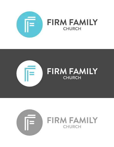
The separable nature of the wordmark and icon allows for versatile logo configurations to suit various applications. When there is a horizontal space to be filled, the preferred option is a logo variation with the icon positioned to the left, creating a balanced composition. On the other hand, for vertical-oriented applications, a stacked lockup configuration will deliver optimal visual impact and better utilize the available space. These adaptable configurations ensure that the logo seamlessly adapts to different layout requirements, maintaining its visual harmony and effectiveness across diverse contexts.
Color
The carefully selected color palette for the logo embodies a contemporary and vibrant aesthetic. Anchored by a vibrant pop of bright blue, the palette deviates from the conventional deep reds and blues often associated with churches, infusing a sense of friendliness and distinctiveness. Complementing this energetic hue, dark and light grey tones provide a grounded and balanced foundation, tempering the overall visual composition. The strategic use of ample white space further enhances the color scheme, allowing the colors to breathe and harmoniously interact with each other, creating an engaging and refreshing visual experience.

At Chico Web Design, a California-based design studio, we specialize in creating enduring logos that bring long-term success to businesses. Contact us today via email or phone to discuss your logo design needs.
