The primary objective of this project is to establish a compelling visual identity for Tribal Roads, capturing their essence and values. When creating a logo, there are three essential criteria that contribute to its longevity and timelessness.
As an agency, our brand identity is reflected through the work we produce for our clients. The logo serves as the punctuation, adding the finishing touch to the message conveyed by our work.
Appropriateness: The logo should seamlessly align with the company’s personality and brand image.
Distinctiveness: It should stand out among competitors and serve as a distinctive marker for the brand.
Simplicity: Simple logos endure the test of time, remaining memorable and versatile across various applications.
It’s important to note that instant love for a logo is rare. The true meaning and emotional connection to a logo develop over time through consistency and cohesive branding efforts.
The Symbol
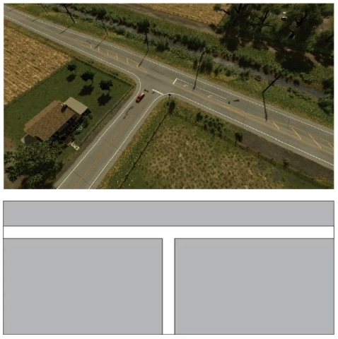
The concept that continuously resonated during the design process revolves around the notion of an “intersection.” Tribal Roads’ distinctiveness arises from the convergence of tribal relations, transportation consulting, and software expertise.
The letter “T,” the initial of the company name, often symbolizes an intersection, serving as a fundamental element to explore and shape the logo’s potential. It forms a strong foundation for the creative direction of the logo.
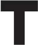
FIG 01. Basic T Shape
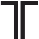
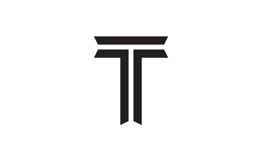
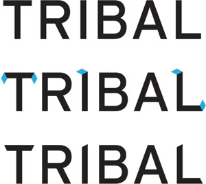
Using a “T” as the foundation I added a custom typography, style known as in-line.
FIG 02. In-line T
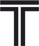
The “In-line T” represents a road intersection. This style of typography is commonly used to evoke a “tribal” feeling.
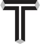
FIG 03. Fla red In- line T
To help enhance the tribal feeling, a rhombus is used to create flared ends.
FIG 04. Fla red In- line T
This symbol strikes a balance between tribal and roads in a simple yet sophisticated way.
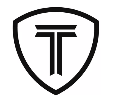
Logo Icon
A logo icon holds immense appeal due to its ability to convey a visual representation of a brand in a concise and memorable way. It captures the essence of a brand’s identity, values, and personality, allowing for instant recognition and emotional connection with the audience. A well-designed logo icon possesses the power to communicate complex ideas and evoke positive associations, making it a highly appealing and effective branding tool.
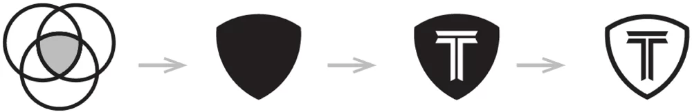
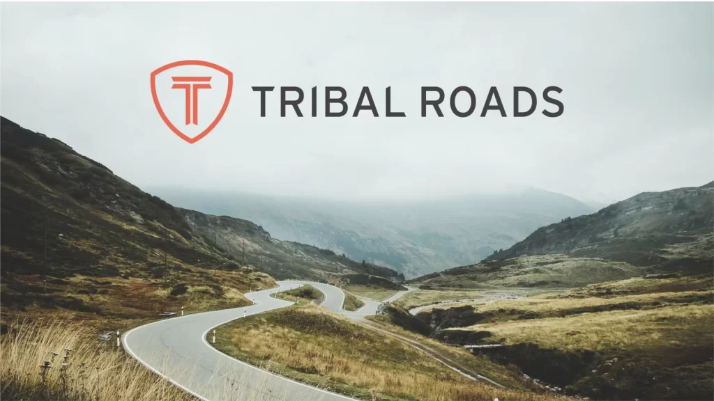
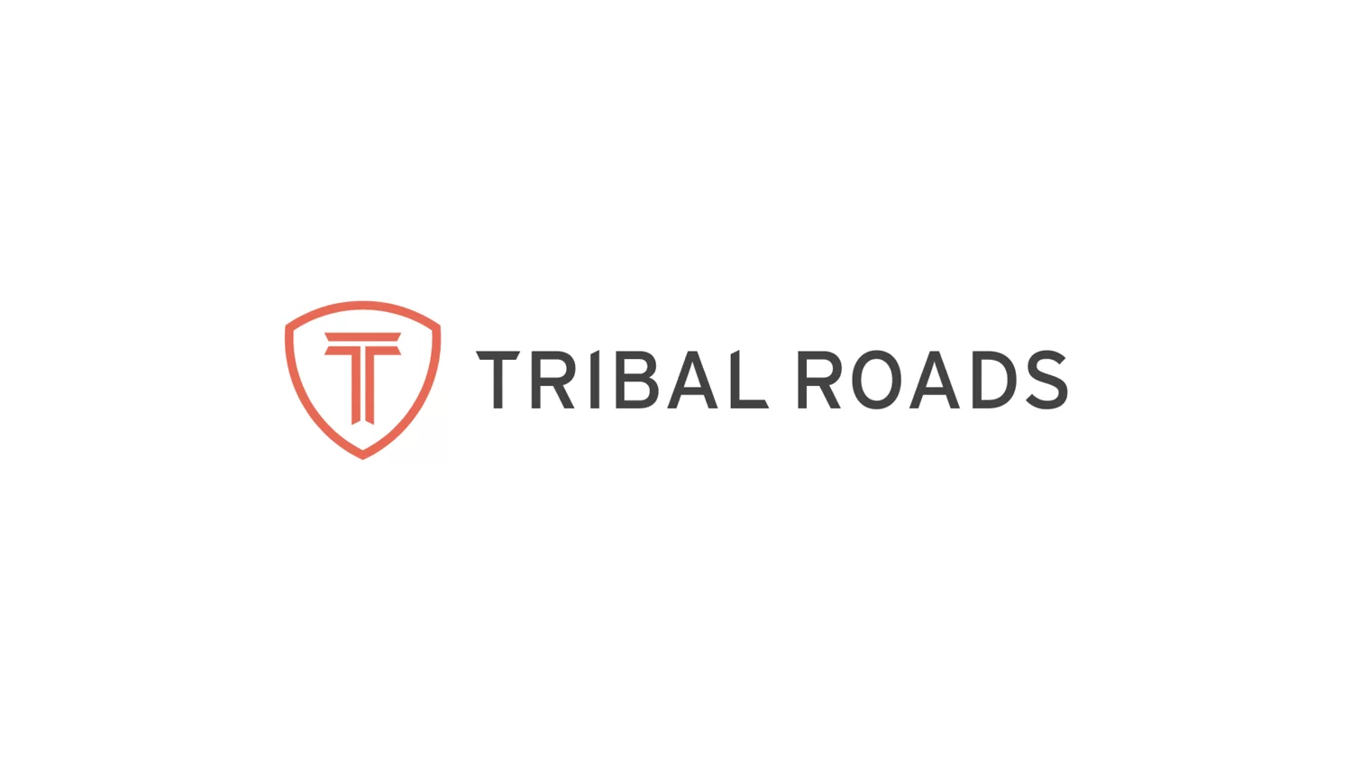
To enhance the versatility of the T symbol across various formats, a carefully crafted container shape has been introduced. Inspired by abstract road signs, this unique shape consists of three intersecting circles forming a triangular structure. Not only does this container shape effectively balance the negative space, but it also provides an aesthetically pleasing framework for the T. Its widening top and narrowing bottom create a visually flattering composition that adds a touch of dynamic appeal to the overall design.
Wordmark
With the symbol now finalized, our attention shifts to the presentation of the company name. When a distinctive symbol takes center stage, the most effective approach is to pair it with a complementary typeface that accentuates its impact.
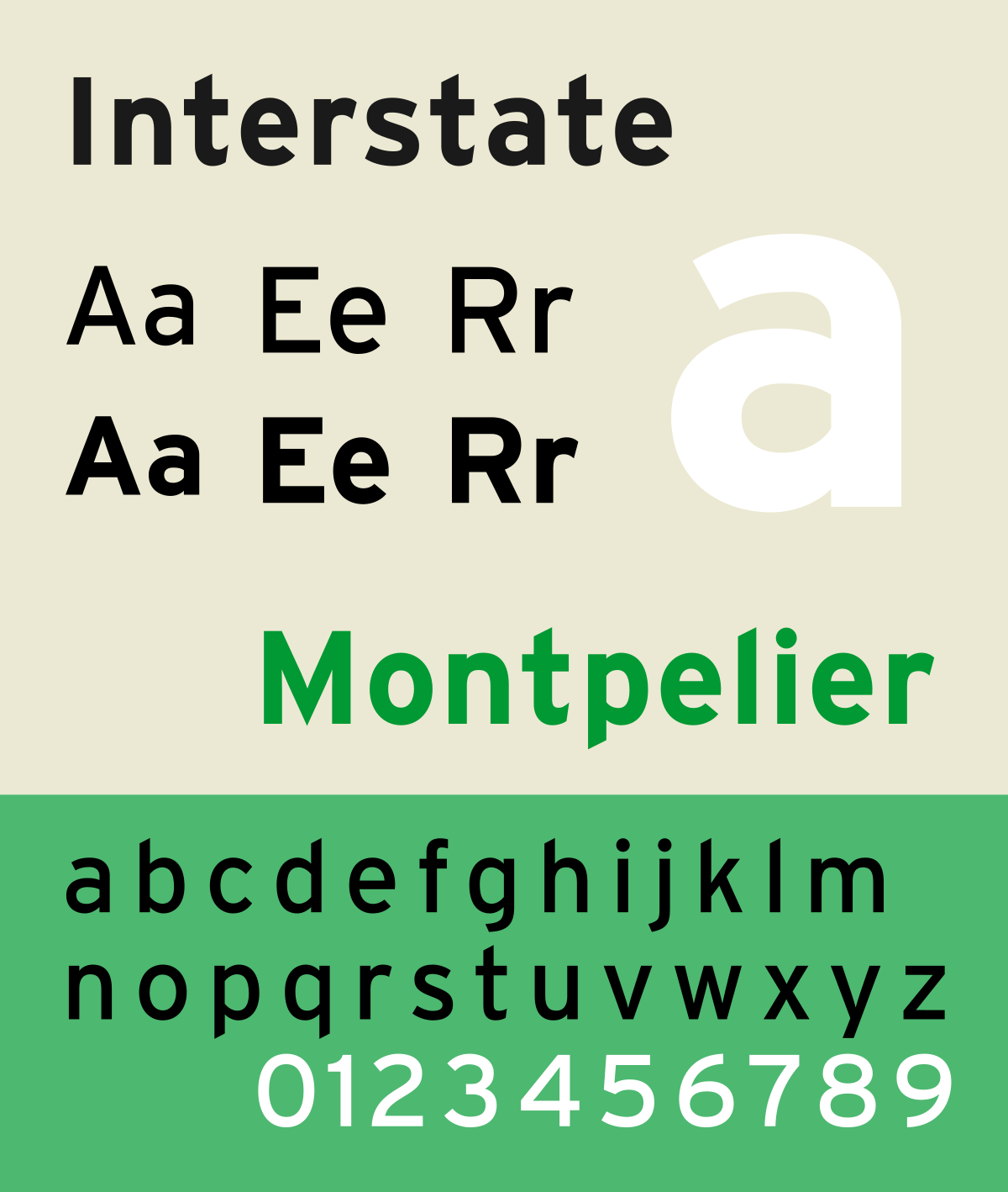
Introducing Interstate, the chosen typeface for this project. Inspired by American road signage, Interstate is a sharp, highly legible font that perfectly aligns with the essence of “Tribal Roads.” Its lowercase letters boast sharp angles that mirror the aesthetics of the symbol, creating a harmonious visual connection between the two elements.
By incorporating Interstate as the brand typeface, we not only achieve a cohesive and unified identity but also infuse a sense of dynamism and relevance that resonates with the core values of the company.
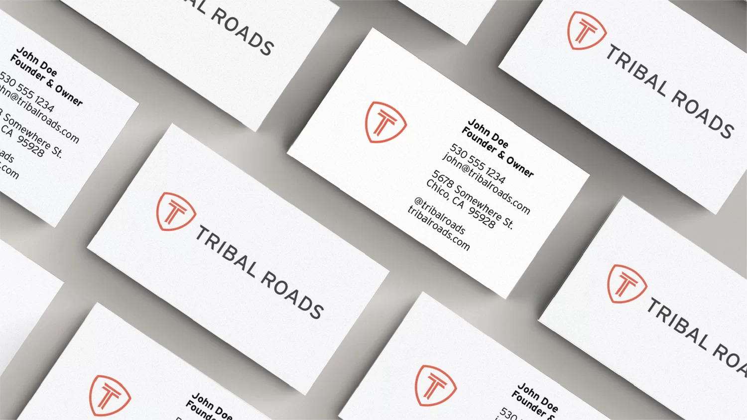
Lockup
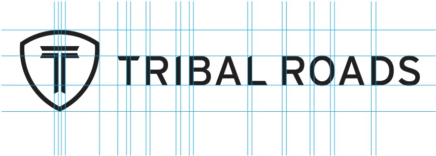
Achieving a harmonious and balanced composition between the wordmark and symbol is of paramount importance. To accomplish this, careful attention has been given to the font selection, ensuring that it complements the symbol seamlessly. The font has been meticulously weighted to maintain a consistent stroke width, aligning it with the visual prominence of the symbol.
By carefully adjusting the font’s characteristics, we have accentuated the significance of the symbol, allowing it to command attention and become the focal point of the design. This deliberate emphasis on the symbol ensures that it takes center stage, conveying the core essence and importance of your brand in a visually compelling manner.
Lockup
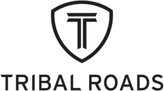
When confronted with limited space, a strategic solution is to position the symbol at the top of the wordmark, ensuring optimal utilization of the available area.
To maintain a harmonious and well-proportioned composition in this arrangement, the name has been thoughtfully scaled down. This deliberate adjustment ensures that the symbol retains its prominence while allowing the wordmark to seamlessly integrate, creating a visually balanced and aesthetically pleasing logo.
By carefully considering the spatial constraints and employing a meticulous approach to the logo’s design, we have achieved a configuration that maximizes impact and readability, even within confined dimensions.
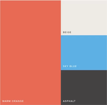
Color
Our color palette, inspired by Native American tribal art, is carefully crafted to evoke the desired brand sentiments. Vibrant orange signifies change and improvement, while beige provides a soft neutral backdrop. Sky blue draws attention to key actions, and asphalt adds a touch of sophistication to text and foundational elements. This thoughtfully curated palette establishes a strong emotional connection with the audience, leaving a lasting impression.
At Chico Web Design, a California-based design studio, we specialize in creating enduring logos that bring long-term success to businesses. Contact us today via email or phone to discuss your logo design needs.
20% Discount
Through May 31, we are offering a 20% discount on all new web design contacts! The discount will be displayed on the agreement.